Current Practice is a design studio specialised in branding. Through strategy and design, we partner with small businesses and individuals to help tell their story.
Lumaura Psychology
,
Visual Identity
,
2025
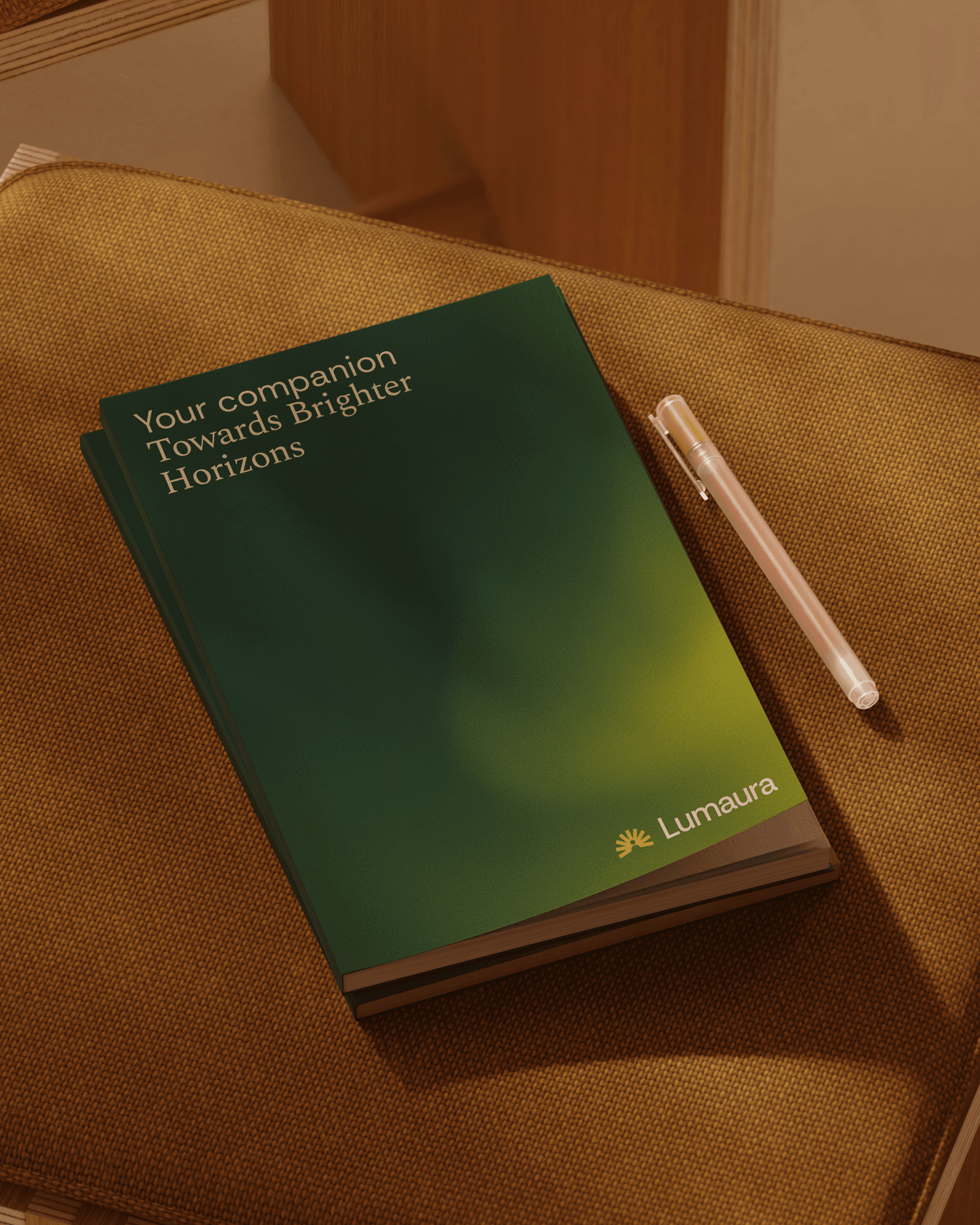
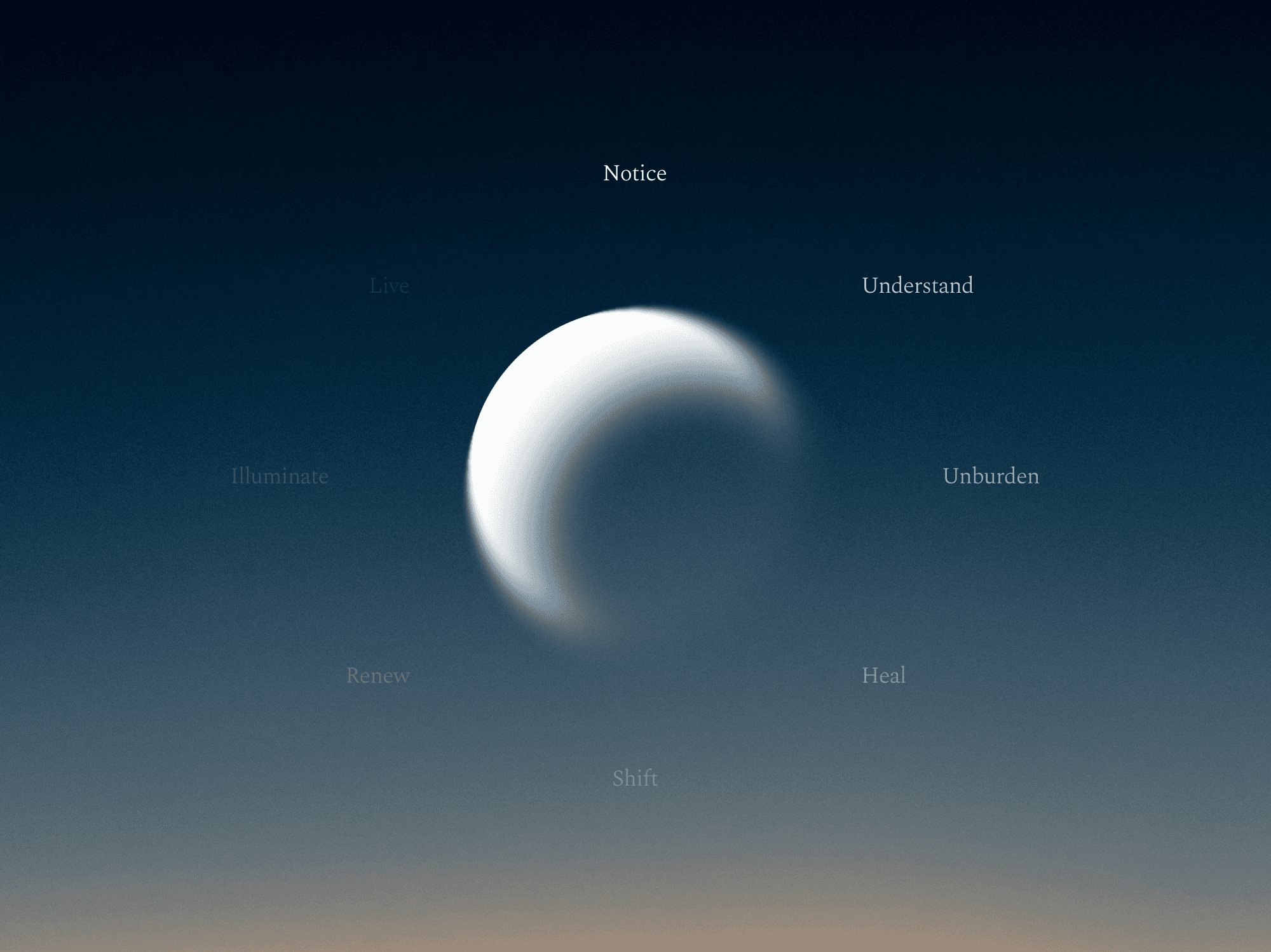
Lumaura is a psychology brand shaped to feel calm, warm and deeply human. The identity is built around clarity and emotional softness, reflecting the brand’s focus on personal growth and inner connection. Visual expression, language and structure balance professionalism with empathy — creating a space that feels safe, supportive and grounded for clients seeking guidance, healing and change.

LP_01.JPG

LP_02.JPG
LP_03.JPG

LP_04.JPG
LP_05.JPG

LP_06.JPG

LP_07.JPG

LP_08.JPG

LP_09.JPG
Lumaura Psychology
,
Visual Identity
,
2025
Lumaura is a psychology brand shaped to feel calm, warm and deeply human. The identity is built around clarity and emotional softness, reflecting the brand’s focus on personal growth and inner connection. Visual expression, language and structure balance professionalism with empathy — creating a space that feels safe, supportive and grounded for clients seeking guidance, healing and change.
LP_01.JPG
LP_02.JPG
LP_03.JPG
LP_04.JPG
LP_05.JPG
LP_06.JPG
LP_07.JPG
LP_08.JPG
LP_09.JPG
Club Martyn
,
Visual Identity
,
2024
Club Martyn is a pilates grip-sock brand defined by movement, style and confidence. The rebrand elevated the product from a functional accessory to a fashion-driven sports lifestyle item. Bold typography, energetic colour and strong art direction capture the feeling of rhythm, sweat and expression — bringing a playful edge to the pilates world and creating a brand built to move.

CM_01.JPG

CM_02.JPG

CM_03.JPG

CM_04.JPG

CM_05.JPG

CM_06.JPG

CM_07.JPG

CM_08.JPG

CM_09.JPG

CM_10.JPG
Club Martyn
,
Visual Identity
,
2024
Club Martyn is a pilates grip-sock brand defined by movement, style and confidence. The rebrand elevated the product from a functional accessory to a fashion-driven sports lifestyle item. Bold typography, energetic colour and strong art direction capture the feeling of rhythm, sweat and expression — bringing a playful edge to the pilates world and creating a brand built to move.
CM_01.JPG
CM_02.JPG
CM_03.JPG
CM_04.JPG
CM_05.JPG
CM_06.JPG
CM_07.JPG
CM_08.JPG
CM_09.JPG
CM_10.JPG
Salt & Stem
,
Visual Identity
,
2025
Salt & Stem is a boutique floral studio based on the Gold Coast, offering refined arrangements that blend elegance with natural expression. The visual identity is delicate and intentional, emphasising beauty through restraint and thoughtful detail. The result is a brand that feels slow, romantic and artisanal — one that honours both the artistry of floristry and the emotion behind every stem.

S&S_01.jpg

S&S_02.jpg

S&S_03.jpg

S&S_04.jpg

S&S_05.jpg

S&S_06.jpg

S&S_07.jpg
S&S_08.mp4
Salt & Stem
,
Visual Identity
,
2025
Salt & Stem is a boutique floral studio based on the Gold Coast, offering refined arrangements that blend elegance with natural expression. The visual identity is delicate and intentional, emphasising beauty through restraint and thoughtful detail. The result is a brand that feels slow, romantic and artisanal — one that honours both the artistry of floristry and the emotion behind every stem.
S&S_01.jpg
S&S_02.jpg
S&S_03.jpg
S&S_04.jpg
S&S_05.jpg
S&S_06.jpg
S&S_07.jpg
S&S_08.mp4
HandsOn
,
Visual Identity
,
2025
HandsOn is a multidisciplinary allied health provider offering hand therapy, physiotherapy and exercise physiology across Queensland. The brand refresh established a more contemporary, approachable identity to reflect their expansion beyond specialist hand therapy and into broader injury rehabilitation and wellness services. Insight-led strategy, a refined visual system and cohesive tone of voice position HandsOn as trusted experts with genuine care at the core of their practice.

HO_1.JPG

HO_2.JPG

HO_3.JPG

HO_4.JPG

HO_5.JPG

HO_6.JPG

HO_7.JPG

HO_8.JPG

HO_9.JPG

HO_10.JPG
HandsOn
,
Visual Identity
,
2025
HandsOn is a multidisciplinary allied health provider offering hand therapy, physiotherapy and exercise physiology across Queensland. The brand refresh established a more contemporary, approachable identity to reflect their expansion beyond specialist hand therapy and into broader injury rehabilitation and wellness services. Insight-led strategy, a refined visual system and cohesive tone of voice position HandsOn as trusted experts with genuine care at the core of their practice.
HO_1.JPG
HO_2.JPG
HO_3.JPG
HO_4.JPG
HO_5.JPG
HO_6.JPG
HO_7.JPG
HO_8.JPG
HO_9.JPG
HO_10.JPG
Webber Equipment
,
Visual Identity
,
2022
Webber Equipment is a global supplier of equipment for commercial and industrial applications. The visual identity is minimal, strong and grounded — reflecting the brand’s reputation for capability and resilience. With a clean mark and a robust typographic system, the brand feels established and confident, reinforcing reliability in supply, scale and long-term industry trust.

WE_01.JPG
WE_02.mp4

WE_03.JPG

WE_04.JPG

WE_05.JPG

WE_06.JPG
Webber Equipment
,
Visual Identity
,
2022
Webber Equipment is a global supplier of equipment for commercial and industrial applications. The visual identity is minimal, strong and grounded — reflecting the brand’s reputation for capability and resilience. With a clean mark and a robust typographic system, the brand feels established and confident, reinforcing reliability in supply, scale and long-term industry trust.
WE_01.JPG
WE_02.mp4
WE_03.JPG
WE_04.JPG
WE_05.JPG
WE_06.JPG
TRUEPROOF
,
Visual Identity
,
2024
Trueproof provides high-quality waterproofing solutions built on expertise, durability and trust. The identity focuses on precision and reliability, supported by a graphic system that feels structured, practical and confidently engineered. The brand delivers clarity across touchpoints, presenting Trueproof as a dependable partner for builders, developers and homeowners who value quality work done right.
TP_01.mp4

TP_02.JPG

TP_03.JPG

TP_04.JPG

TP_05.JPG

TP_06.JPG
TRUEPROOF
,
Visual Identity
,
2024
Trueproof provides high-quality waterproofing solutions built on expertise, durability and trust. The identity focuses on precision and reliability, supported by a graphic system that feels structured, practical and confidently engineered. The brand delivers clarity across touchpoints, presenting Trueproof as a dependable partner for builders, developers and homeowners who value quality work done right.
TP_01.mp4
TP_02.JPG
TP_03.JPG
TP_04.JPG
TP_05.JPG
TP_06.JPG